Lawrence Yun, chief economist for the NAR, said he believes existing home sales will gradually rise over the next year as "pent up demand" is unleashed.I happen to have some other pictures showing "pent up demand" to add to the collection.
In the meantime, while Mr. Yun awaits the unleashing of "pent up demand," we'll continue to follow the "pent up supply" of housing that is being relentlessly unleashed.
Existing Home Inventory
click on chart for sharper image
Home Ownership 1900-2007

click on chart for sharper image
Inquiring minds noticing the huge pent up demand depicted by the above chart are no doubt asking "Pent up demand at what price?" That's a good question too. I think some clues are in the following chart.
House Price To Rental Ratio

click on chart for sharper image
Prior to things going completely insane in 2002, the last peak in house price to rental ratios was in 1980-1982 when mortgage rates were near 15%, Fed rates near 18% and inflation running rampant. Never before in history has it been so cheap to rent relative to own.
The above charts courtesy of the Wall Street Journal article U.S. Mortgage Crisis Rivals S&L Meltdown.
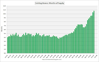
Robert Shiller, a Yale University economist who has made a career out of studying bubbles, says the last bear market in stocks may have also made houses more appealing. A 2003 survey of home buyers he conducted with a colleague found 10 times as many said the stock market's collapse encouraged them to buy a home as said it discouraged them. Their thinking, Mr. Shiller says, went like this: "I'm fed up with the stock market, I had so many promises of high returns and my broker and the accountants were deceiving us. But homes have always gone up in value, and it gives me great satisfaction to own a home and I can see it everyday."Calculated Risk always puts out interesting housing charts so let's take a look at housing inventory in terms of months supply.
But after years of living off the debt-financed increases in the value of their homes, U.S. consumers are in uncharted territory. "A lot of people, including me, have been saying that the country has been spending more than it's been producing, and that will have to come to an end," says Mr. Volcker. "The question is: Does it come to an end with a bang or whimper?"
Existing Homes: Month's Supply

click on chart for sharper image
In When will Housing Bottom? I presented this look on Pent Up Demand.
New Single Family Home Sales

click on chart for sharper image
Housing Starts 1959 - Present

click on chart for sharper image
In Housing - The Worst Is Yet To Come I presented the following chart courtesy of Credit Suisse that seems pertinent to the discussion.
Monthly Mortgage Rate Resets 2007-2015

Subprime resets peak in 2008 but Alt-A and Pay Option ARM problems which are just as big if not bigger do not peak until 2011. The problem with foreclosures has really just started. Looking at the above chart perhaps we get a bounce in 2009 before the final collapse heading into 2012.
Perhaps by then home prices will be back at more realistic levels. Here is the irony of the situation: For all the talk about affordable housing, most of the affordable housing hypocrites do not really want prices to fall.
In the meantime, if anyone starts yapping about "pent up housing demand" please show them the above charts.
Mike "Mish" Shedlock
http://globaleconomicanalysis.blogspot.com
Click Here To Scroll Thru My Recent Post List


No comments:
Post a Comment